Oh no, what is this nonsense? PlayStation clutters up the TV and Video tab
Oh no. No, no, no. A thousand "no's".
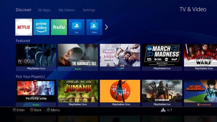
PlayStation unexpectedly updated the layout of the the TV and Video tab, and the results are less than spectacular. Before the update, users were able to use the left stick to highlight the TV and Video icon from the dashboard, wait a moment for the apps to populate, then select the desired app and click the "x" button to load it.
With this new configuration, users have to click "x" to enter into the new TV and Video UI, where they are bombarded with a bunch of nonsense content that they neither requested or desired. The app icons are shrunk down and relegated to the upper left of the UI, with the body of the screen filled with a mish-mash of popular content from a variety of apps. This includes a pile of content for PlayStation Vue and PlayStation Store movie rentals, neither of which I have any interest in.
Scrolling down through the content, I also came across featured programming for non-PlayStation services that I do not subscribe to, like CrunchyRoll. There is no way that PlayStation is stacking this content in order of popularity. The appearance of programming on this UI has to be organized by a "pay to show" dynamic, with PlayStation's own programming getting the lion's share of prime real estate.
If you couldn't tell, I am absolutely not a fan of this new UI. In my day job, I work in software design, and we struggle daily to figure out ways to deliver desired functionality in a clean manner with less "clicks". While making user click one extra button to get to where they want to go might not seem like a big deal, it is surprising how much people freak out about it. This new UI is clearly a way for Sony to jam their paid content in front of the user, giving them additional visibility to their offerings and allowing other content providers the privilege of paying extra to get their stuff into featured areas.
When my wife (who is not involved in the tech world and has no interest in design) saw this new UI last night, she commented "What is all this garbage?" I can't help but think that this will be the reaction of the standard user. We will learn to work around it, but that doesn't mean we have to like it.