Atlus's Game of Thrones RPG looks more like the books than the TV series
posted:
4/12/2012 9:25:00 AM
More On:
Game of Thrones
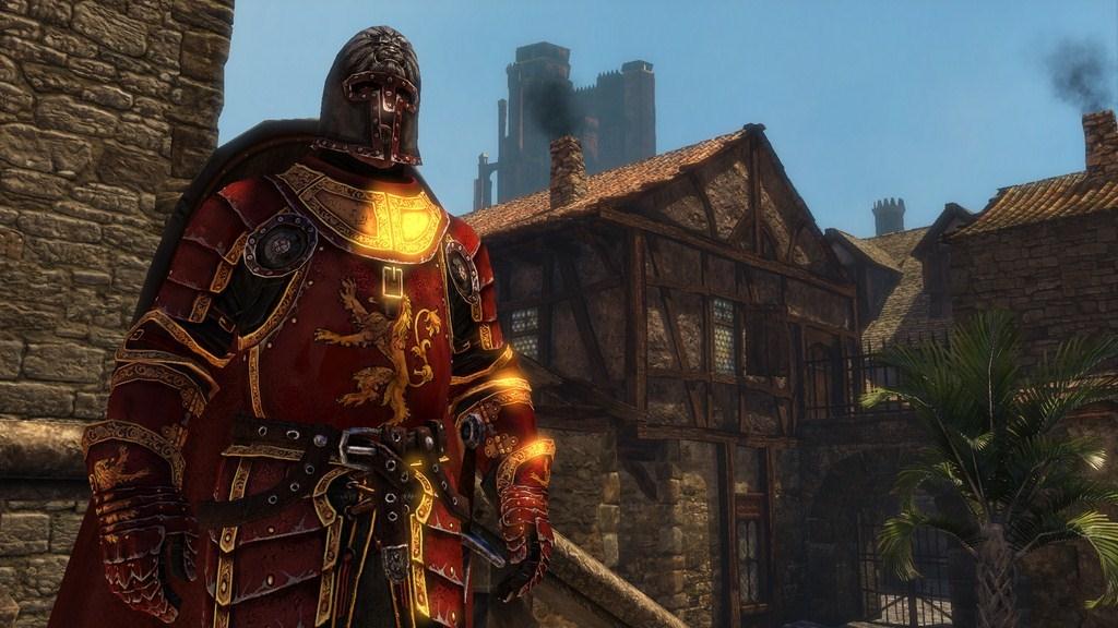
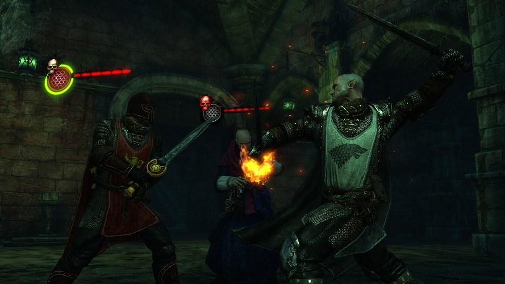
As great as HBO's Game of Thrones adaptation is, there's one aspect to it that bugs me and that's the design of the armor and costumes. Many of the things people wear are described in the books as brightly colored, bold or even down right garish, while highbornes and upjumped commoners prominently wear the sigils of their houses. Suits of armor are strikingly colored. In many cases, helms sport large crests that represent the sigil of a particular house.
Yet the TV series goes in the opposite directing by making the armor and costumes as drab as possible. Maybe it's to fit the gritty atmosphere or maybe they're afraid of making it look cheesy and cartoonish. I don't know. What I do know is that even where it wouldn't be cheesy or cartoonish, like knights wearing surcoats, or a sigil displayed anywhere other than a banner, they still opt for plain.
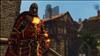
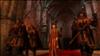
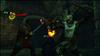
Atlus's Game of Thrones RPG, on the other hand, is doing its best to stay true to the books, as the following screen shots indicate. They have it all: brightly colored armor, ridiculous crests, surcoats, prominently displayed sigils, and best of all, proper looking mail and plate for the Gold Cloaks.
The jury is still out on the rest of Atlus's Game of Thrones, which doesn't come out until May, but at least they've nailed that one particular aspect of the world right on its head.

Yet the TV series goes in the opposite directing by making the armor and costumes as drab as possible. Maybe it's to fit the gritty atmosphere or maybe they're afraid of making it look cheesy and cartoonish. I don't know. What I do know is that even where it wouldn't be cheesy or cartoonish, like knights wearing surcoats, or a sigil displayed anywhere other than a banner, they still opt for plain.
Atlus's Game of Thrones RPG, on the other hand, is doing its best to stay true to the books, as the following screen shots indicate. They have it all: brightly colored armor, ridiculous crests, surcoats, prominently displayed sigils, and best of all, proper looking mail and plate for the Gold Cloaks.
The jury is still out on the rest of Atlus's Game of Thrones, which doesn't come out until May, but at least they've nailed that one particular aspect of the world right on its head.